3.2 Excel Graphs
Excel refers to graphs as charts. A graph is worth a million numbers! Only a few of us can look at a series of numbers and see patterns. Most of us need help in the form of graphs. Therefore, as the first step in any data analysis, we like to visualize our data to see what is really going on. The statistician Francis Anscombe used four simple data sets to demonstrate the importance of graphing data. These four data sets, known as Anscombe’s Quartet, show that relying on simple summary statistics can be misleading if you rely on them without graphing the data. Every time, you start analyzing a new data set, you determine the data type and measurement scale of the variables first and then create graphs that suit those variables best.
Practice File: Example Data xlsx
3.2.1 Elements of a Chart
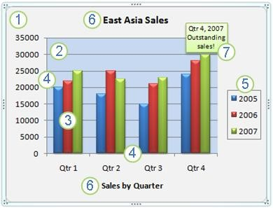
Let’s get to know the components or elements of an Excel chart so that we can communicate efficiently about what needs to be included in graphs. Microsoft provides a nice overview of how to create a chart from start to finish as shown below:

- Chart area, which is essentially the entire chart
- Plot area is the area where data points are displayed, bounded by axes
- Data points of the data series plotted in the chart (e.g., bars, columns, lines, dots). Excel uses the term ‘data markers.’
- Horizontal (X) and vertical (Y) axis along which data is plotted
- Legend, which describes the data series
- Chart and axis title
- Data label, which identifies details of a data point in a data series
It is EXTREMELY important that you label your graphs sufficiently. Use a legend to describe data points and label your axes! Axis labels should include the variable names and units. You may not need a title if you add a figure caption when you present the graph. Looking at the chart above from Microsoft’s “Create a chart start to finish” site, do you see anything that may be missing? What about a Y-axis label? Do you know what the numbers on the Y-axis stand for? $US, Canadian $, Euros? I have no idea? I can only guess that it is $US based on this coming from a US webpage. REMEMBER: always label your graphs sufficiently!
Excel allows you to edit all the elements of a chart. A good way to start is to right-click on the chart element that you want to change and see what options you get in the window that opens up. You can also simply click anywhere in the chart to display the Chart Tools. Choose the Current Selection Group in the Format tab use the drop-down menu to select the element you want to format.
Video: Creating Charts in Excel
The following video will teach you how to create graphs from data stored in excel. Inserting charts automatically is a skill that you will use often, and knowing how to properly select the correct graph type will allow you to be efficient.
Scatterplots are used to display the relationship between two numeric variables. Some examples are tree diameter vs. tree height, tree age vs. tree height, mammal bodyweight vs. mammal brain weight (litter size, gestation period in days), and years of work experience vs. salary. Scatterplots allow you to get the first idea of whether two variables are highly correlated or if there is no relationship at all.
Scatterplot file: Example Scatter Plot xlsx
3.2.2 Bar Graphs
Excel refers to bar graphs as either column (vertical bars) or bar charts (horizontal bars). They are typically used for comparing groups. Examples include frequency of trees by decay class, mean salary by gender, amount of carbon by pool (e.g., live vs. dead). Bar graphs can also be used to track changes over time (e.g., precipitation over a year).
Example bar graph: Bar Graph xlsx