library(tidyverse)   # ggplot2, dplyr, readr, ...
library(readxl)      # read_excel()
library(lubridate)   # date helpers
library(here)        # project-relative paths
library(knitr)       # kable()
library(scales) # label_comma(), label_percent()9 Visualize Forestry Data with ggplot2
NoteData for this chapter
This chapter uses the BC silviculture (bc_disturbance_reforestation.xlsx) and BC air-quality (airdata3.csv) files. Click each file name to download it directly, then save it in your data/ folder. For sources and details, see the Datasets Used in This Book page.
Setup — run this first
Run this block once at the start of every session, before any other code in this chapter. library(tidyverse) loads ggplot2 and dplyr, but it does not load scales or knitr — without those separate lines, label_comma() (used in the polishing section) and kable() fail with “could not find function”.
Chapter goals
By the end of this chapter you will be able to:
- Explain the grammar of graphics: data → aesthetic mappings → geometric objects → coordinate system → theme.
- Build a basic plot in three lines using
ggplot(data, aes(...)) + geom_*(). - Use the six most common geoms:
geom_point(),geom_line(),geom_col()/geom_bar(),geom_histogram(),geom_boxplot(), andgeom_smooth(). - Add multiple layers to a single plot and understand the order in which they draw.
- Use
facet_wrap()for small multiples (one panel per category) andfacet_grid()for two-dimensional grids. - Polish a plot with labels (
labs()), scales (scale_*_continuous(),scale_*_date()), colours (scale_color_*()/scale_fill_*()), and themes (theme_minimal(),theme()overrides). - Save a plot to disk with
ggsave()at a sensible size and resolution. - Recognize when long-format data is needed (and when to call
pivot_longer()before plotting).
Expected output for this chapter
TipWhat you will hand in
- A rendered Quarto HTML report (
frst232_ch09_learner.html) containing at least:- One chart of BC reforestation by fiscal year — a bar or line chart; pick the type that best shows change over time.
- One line chart with two or more series overlaid (e.g., harvested vs natural disturbance vs reforestation across years).
- One histogram of hourly O₃ readings.
- One box plot of O₃ by region.
- One faceted plot (small multiples) showing O₃ over the days of January 2000, faceted by station.
- At least one chart with custom labels (
labs(title, subtitle, x, y, caption)).
- One chart saved to
outputs/as a.pngusingggsave(). - A short group-lab worksheet (or screenshot) submitted to the course site.
9.1 Where we are
Through Chapters 4–8 you imported, inspected, cleaned, summarised, reshaped, and combined forestry data. Chapter 9 turns those tibbles into charts — the most efficient way for a reader to understand a pattern that would be invisible in a table.
A picture is also the most efficient way to lie with data, which is why ggplot2’s grammar makes every visual choice explicit. Every axis, scale, colour, and label is in your code. Choices that Excel hides in menu dialogs are written down where your reader (and future you) can see them.
9.2 Excel-chart-to-ggplot bridge
| Excel chart | ggplot2 geom + extras |
|---|---|
| Column / bar chart | geom_col() (values you supply) / geom_bar() (counts of categories) |
| Line chart | geom_line() |
| Scatter plot | geom_point() |
| Histogram | geom_histogram() |
| Box / whisker plot | geom_boxplot() |
| Area chart | geom_area() |
| Pie chart | geom_col() + coord_polar() — but avoid (pie charts are hard to read; use a bar chart) |
| Trend line / regression line | geom_smooth(method = "lm") |
| Stacked bar | geom_col(position = "stack") |
| Side-by-side (grouped) bar | geom_col(position = "dodge") |
| Multiple charts side by side (small multiples) | facet_wrap(~ category) |
| Manual axis-range setting | scale_y_continuous(limits = c(0, 100)) |
| Chart title / subtitle / data label | labs(title = "...", subtitle = "...", caption = "...") |
| Saving as PNG | ggsave("outputs/myplot.png", width = 7, height = 5) |
9.3 The grammar of graphics — three sentences
A ggplot is built from three pieces:
- Data — a tibble.
- Aesthetic mappings — which column maps to which visual property (x, y, color, fill, size, shape).
- Geometric objects — the shapes that get drawn (points, lines, bars).
A ggplot call says, “Take this tibble, map these columns to these visual properties, and draw these shapes.”
bc <- read_excel(here("data", "bc_disturbance_reforestation.xlsx"),
                 sheet = "Data")

ggplot(data = bc, mapping = aes(x = Fiscal_Year, y = Reforestation_ha)) +
  geom_line()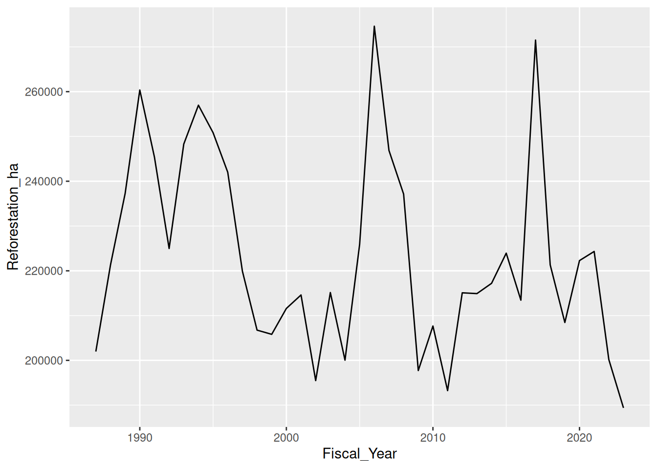
Three things to notice:
ggplot()opens the plot. It does not draw anything yet.aes()says “mapFiscal_Yearto the x-axis andReforestation_hato the y-axis”.geom_line()draws lines connecting the (x, y) points.- The
+sign adds layers — not the pipe|>. This is ggplot2’s one bit of unusual syntax. Read+as “and also draw”.
9.4 geom_point() — scatter plot
ggplot(bc, aes(x = Harvested_ha, y = Natural_Disturbance_ha)) +
  geom_point()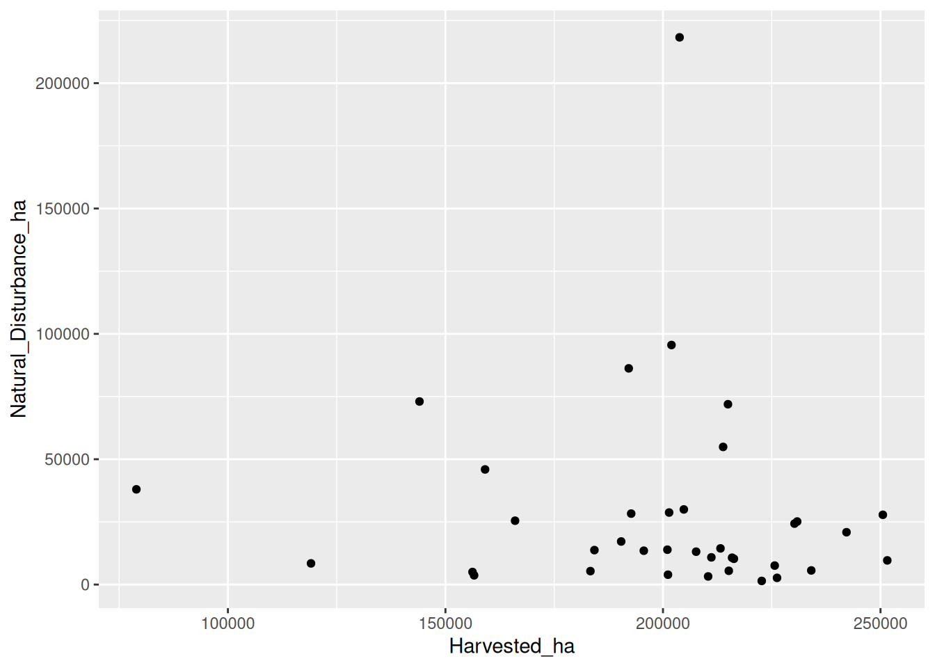
Each year is one dot. No relationship is obvious at this scale, but the chart immediately reveals a few outlier years (large natural-disturbance values) — useful for spotting the 2017 wildfire spike.
9.4.1 Mapping a third variable to colour
ggplot(bc, aes(x = Harvested_ha,
               y = Natural_Disturbance_ha,
               colour = Fiscal_Year)) +
  geom_point(size = 3)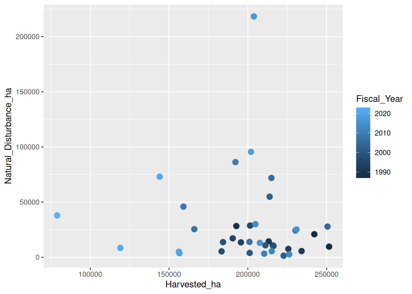
colour = Fiscal_Year adds a third dimension. A continuous variable like year gets a gradient legend.
9.5 geom_line() — time series
# First reshape to long format so each series is a row
bc_long <- bc |>
  select(Fiscal_Year, Harvested_ha,
         Natural_Disturbance_ha, Reforestation_ha) |>
  pivot_longer(cols = -Fiscal_Year,
               names_to = "series",
               values_to = "area_ha")

ggplot(bc_long, aes(x = Fiscal_Year, y = area_ha, colour = series,
                    linetype = series)) +
  geom_line(linewidth = 1)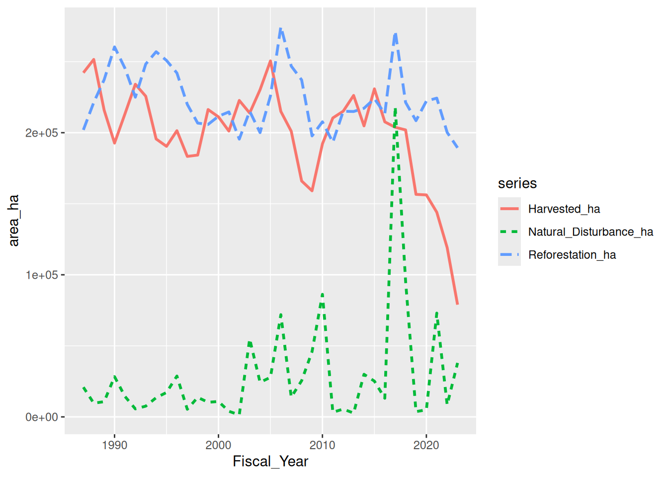
Why long format: with one row per (year, series) combination, ggplot can draw three lines in one call by mapping colour = series. With wide format (three columns) you would need three separate geom_line() calls — much less elegant.
This is why Chapter 8 spent time on pivot_longer(). For plotting, long is almost always the right shape.
9.6 geom_col() vs geom_bar()
NoteAI prompt to check your work
Use this after your own attempt. It should check your reasoning, not hand you the answer:
“I want a chart that shows
[change over time / a distribution / a comparison across groups]from[columns], and I picked[geom_*]. Check whether that geom is the clearest choice for my message, suggest a better alternative if there is one, and list the labels and units the figure needs. Do not produce the final chart code for me.”
The two bar geoms are confused often. The rule:
geom_col()— you give ityvalues to plot.geom_bar()— you give itxvalues and it counts them.
# geom_col — you supply the y value
ggplot(bc, aes(x = Fiscal_Year, y = Reforestation_ha)) +
  geom_col(fill = "#2D6A4F")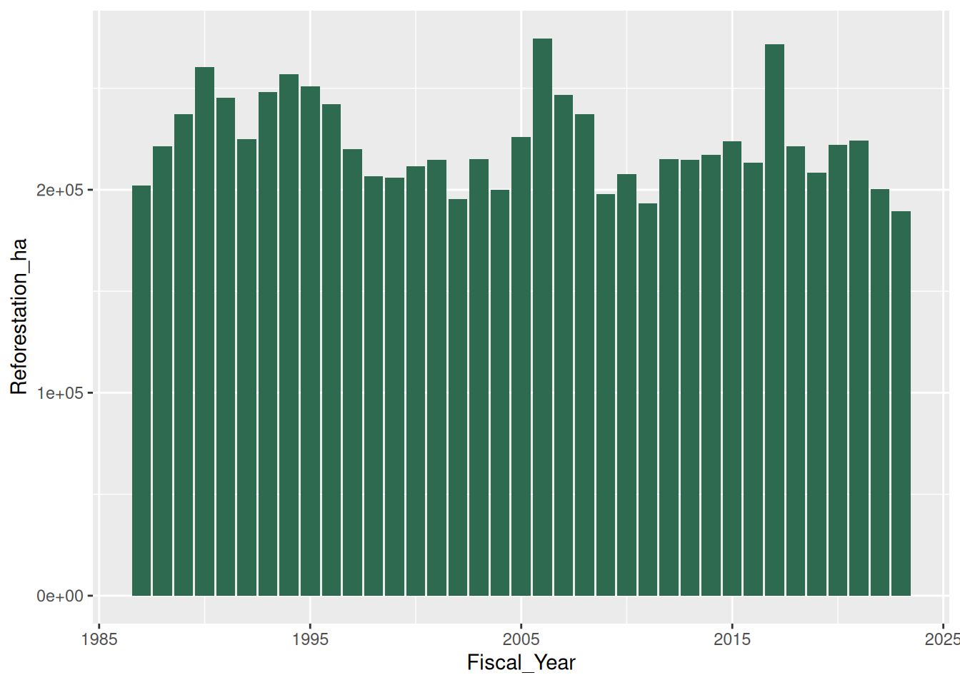
# geom_bar — it counts for you
# Build a small tibble with one row per disturbance event
events <- tibble(
  year = c(2017, 2017, 2017, 2018, 2019, 2019, 2020),
  type = c("fire", "fire", "pest", "fire", "fire", "wind", "fire")
)
ggplot(events, aes(x = type)) +
  geom_bar(fill = "#2D6A4F")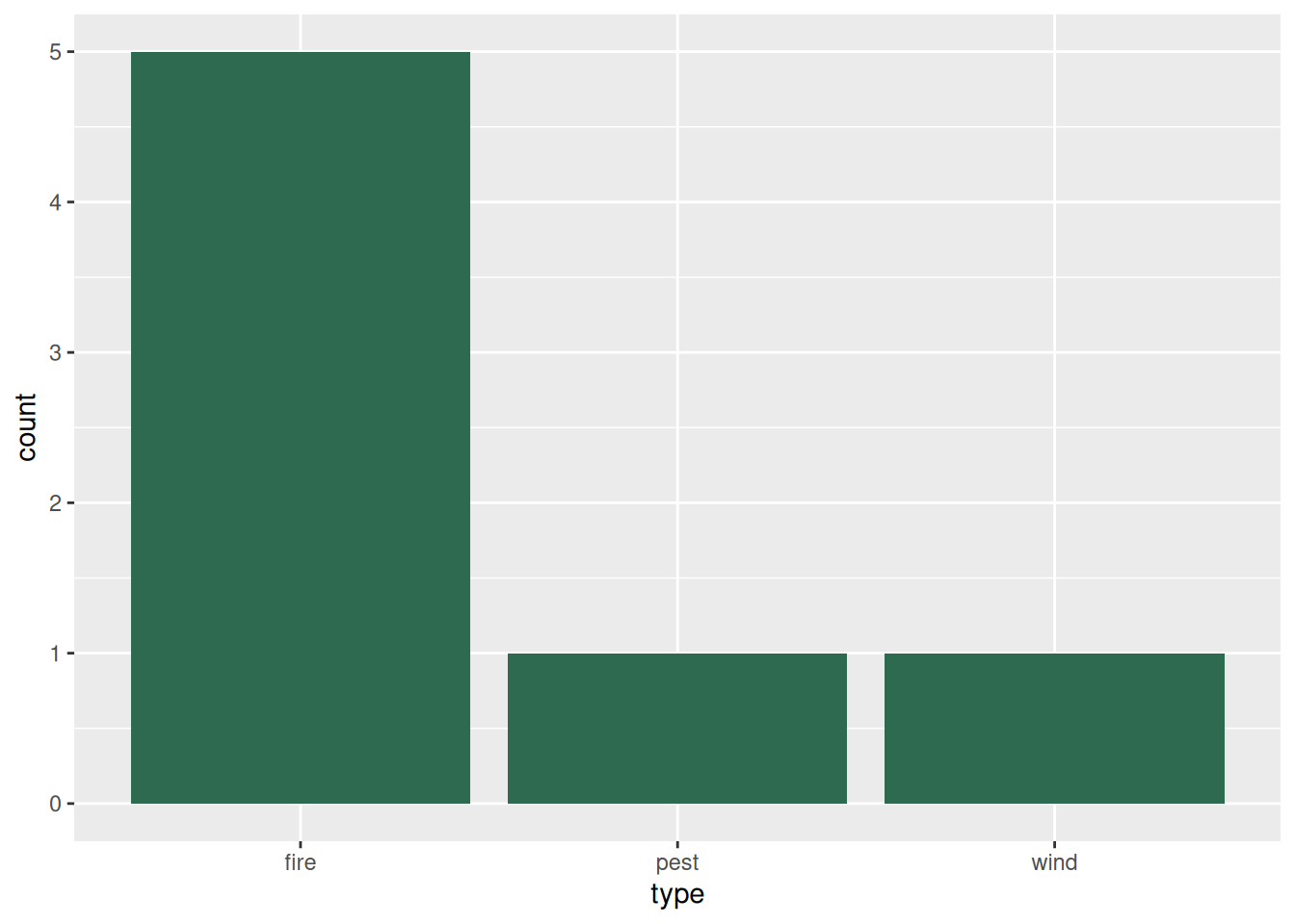
geom_bar produced the count of each type. geom_col would have required a numeric column to use as height.
NoteA fresh import for this chapter
The airdata_clean object below is a new import made here for plotting — it is not the cleaned, region-joined tibble of the same name from Chapter 6. The region column is added later, in the box-plot example (via the station → region lookup). If you copy code that uses region, run that left_join() first, or you will see object 'region' not found.
9.7 geom_histogram() — distribution of one variable
airdata_clean <- read_csv(here("data", "airdata3.csv"),
                          show_col_types = FALSE) |>
  filter(!is.na(O3))
New names:
• `` -> `...1`ggplot(airdata_clean, aes(x = O3)) +
geom_histogram(binwidth = 2, fill = "#2D6A4F", colour = "white")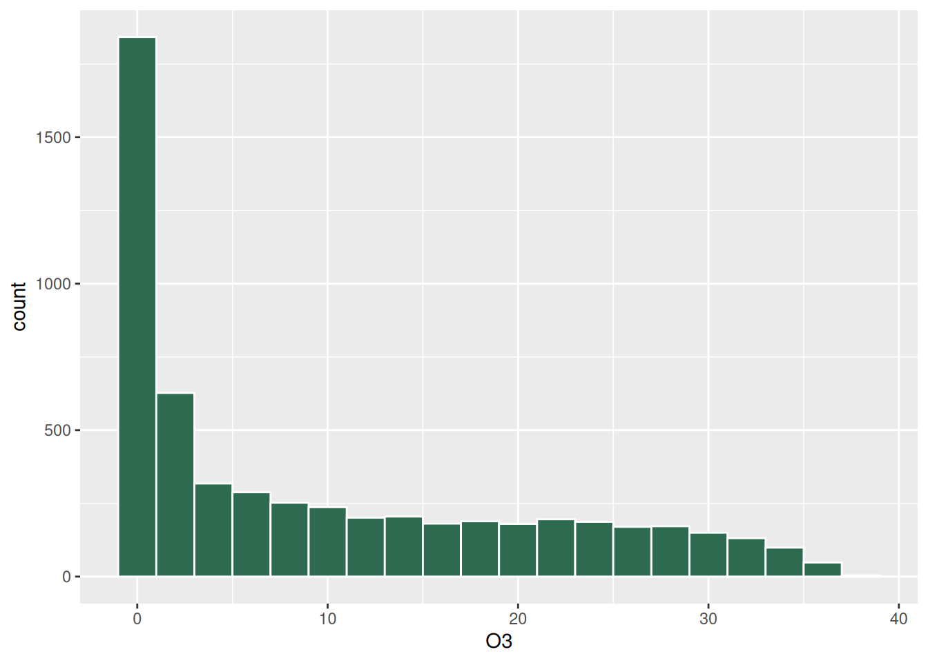
binwidth = 2 puts each bar in a 2 ppb bucket. The histogram reveals the heavily right-skewed O₃ distribution: most hours are clean, a few are sharply elevated. This is the kind of pattern that a summary table can hint at but only a chart makes obvious.
9.8 geom_boxplot() — distributions by group
# First add a region column (from the Ch 6 lookup)
station_regions <- tribble(
  ~location,                          ~region,
  "Burnaby South",                    "Burrard Peninsula",
  "Coquitlam Douglas College",        "North-East Sector",
  "Langley Central",                  "Fraser Valley West",
  "Maple Ridge Golden Ears School",   "North-East Sector",
  "New Westminster Sapperton Park",   "Burrard Peninsula",
  "North Delta",                      "South of Fraser",
  "North Vancouver Second Narrows",   "North Shore",
  "Pitt Meadows Airport",             "North-East Sector",
  "Port Coquitlam North",             "North-East Sector",
  "Port Moody Rocky Point Park",      "North-East Sector",
  "Richmond South",                   "South of Fraser",
  "Tsawwassen",                       "South of Fraser",
  "Vancouver Clark Drive",            "Vancouver",
  "Vancouver International Airport #2","South of Fraser",
  "Vancouver Kitsilano",              "Vancouver",
  "West Vancouver Lions Gate",        "North Shore"
)

airdata_region <- airdata_clean |>
  left_join(station_regions, by = "location") |>
  filter(!is.na(region))

ggplot(airdata_region, aes(x = region, y = O3)) +
  geom_boxplot(fill = "#52B788")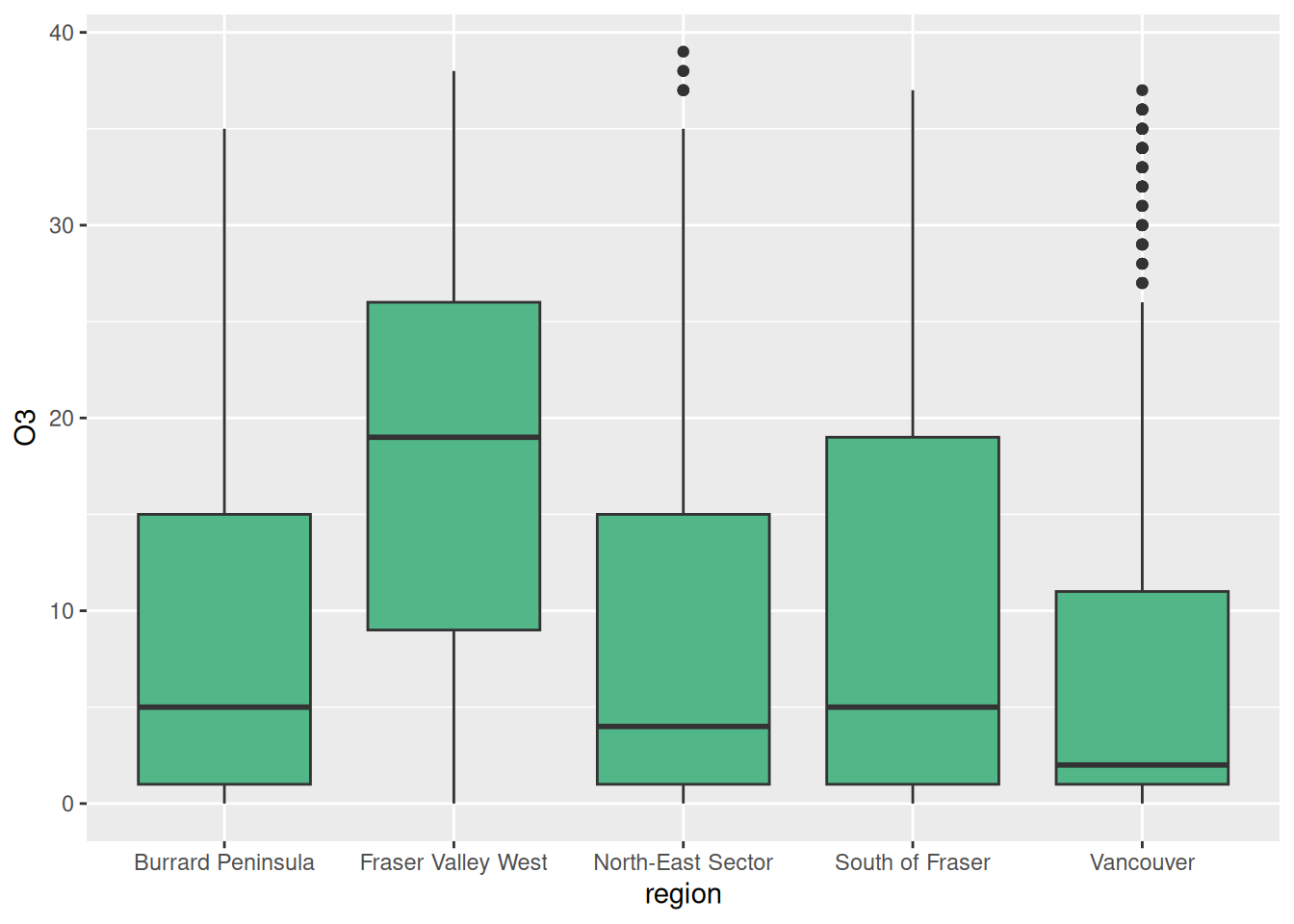
A boxplot shows the median (the line inside the box), the interquartile range (the box itself), and outlier observations (the dots). Reading regional O₃ differences from a single chart is much faster than reading a summary table.
9.9 geom_smooth() — a fitted trend
ggplot(bc, aes(x = Fiscal_Year, y = Reforestation_ha)) +
  geom_point() +
  geom_smooth(method = "loess", se = TRUE)
`geom_smooth()` using formula = 'y ~ x'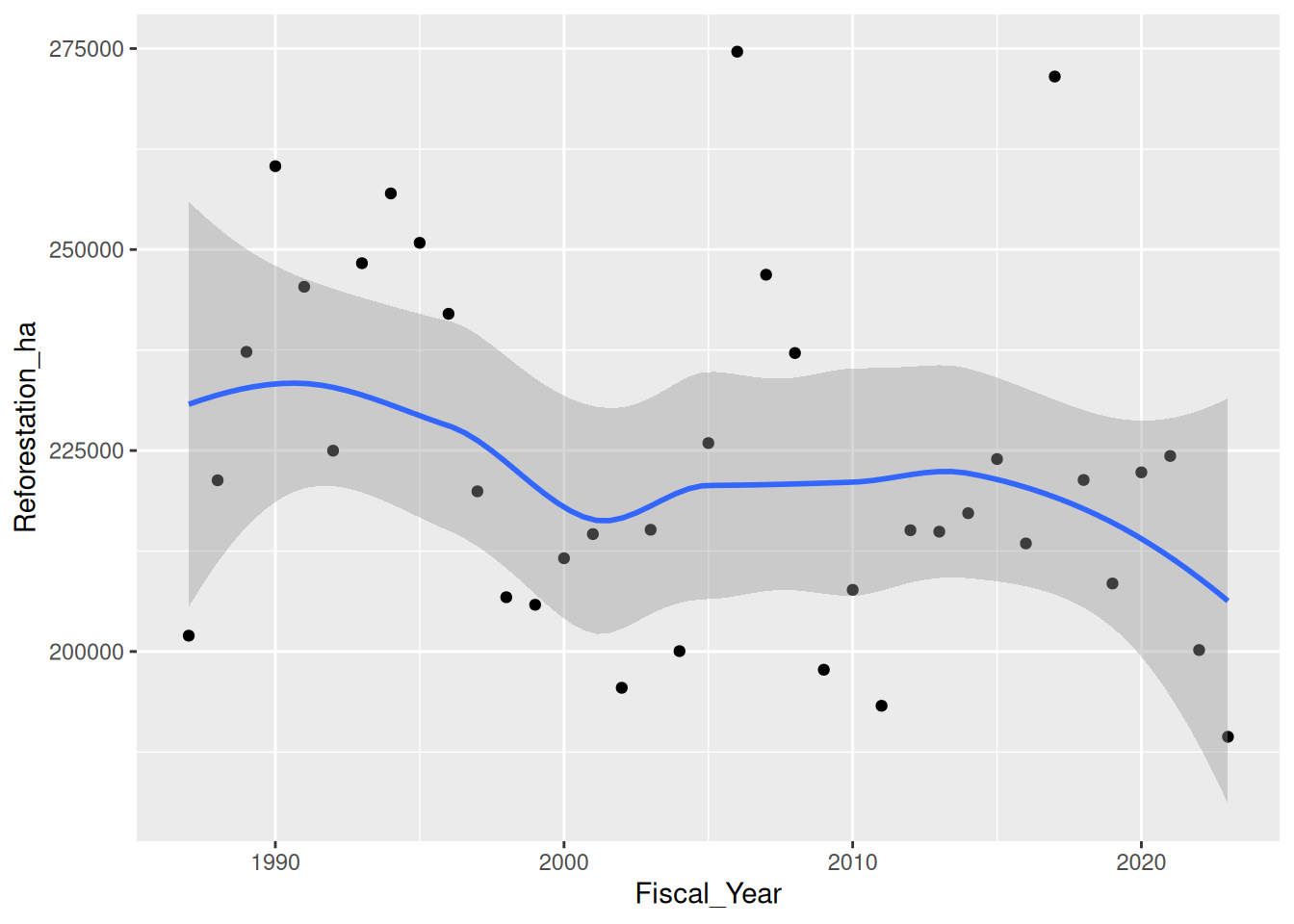
geom_smooth() fits a smooth curve through the points. method = "loess" is a local-regression smoother — flexible, makes no parametric assumptions. method = "lm" would give you a straight linear-regression line.
The shaded ribbon is the 95% confidence band. Toggle with se = FALSE if you do not want it.
TipLayers draw in order
Every + geom_*() adds a layer on top of the previous one. In the example above, geom_point() draws the dots first, then geom_smooth() draws the line on top. Reversing the order would hide the dots behind the ribbon.
Read + as “and also draw”, in order.
9.10 Faceting — small multiples
When you have one chart you want repeated for each group, use facet_wrap():
ggplot(airdata_region, aes(x = O3)) +
  geom_histogram(binwidth = 2, fill = "#2D6A4F", colour = "white") +
  facet_wrap(~ region)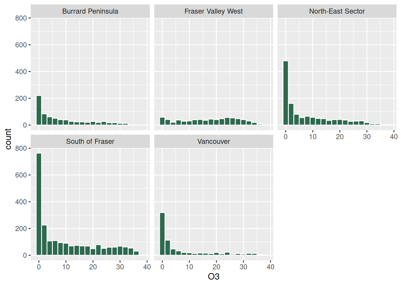
One panel per region. Same axes by default — change with scales = "free_y" if a single y-axis is too compressed.
facet_grid(rows ~ cols) produces a 2D grid; less common but useful when you have two grouping variables.
9.11 Polish — labels, scales, theme
A scientific or professional chart needs labels, formatted axes, and a clean theme:
ggplot(bc, aes(x = Fiscal_Year, y = Reforestation_ha)) +
  geom_col(fill = "#2D6A4F") +
  scale_y_continuous(labels = label_comma()) +
  scale_x_continuous(breaks = seq(1990, 2025, by = 5)) +
  labs(
    title    = "BC Reforestation Area, 1987–2023",
    subtitle = "Annual area reforested (planted or naturally regenerated)",
    x        = "Fiscal year",
    y        = "Reforested area (hectares)",
    caption  = "Source: Environmental Reporting BC (Open Government Licence — BC)"
  ) +
  theme_minimal(base_size = 12) +
  theme(plot.title = element_text(face = "bold"),
        plot.subtitle = element_text(colour = "grey40"))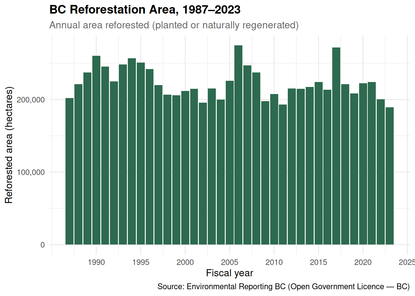
Key polishing pieces:
scale_y_continuous(labels = label_comma())— adds thousands separators to the y-axis (8,264,063 not 8264063).scale_x_continuous(breaks = ...)— controls which years appear on the x-axis.labs(...)— title, subtitle, axis labels, caption.theme_minimal()— a clean theme. Other built-ins:theme_classic(),theme_bw(),theme_void().theme(...)— fine-grained overrides like fonts and colours.
9.12 Saving a plot
my_plot <- ggplot(bc, aes(x = Fiscal_Year, y = Reforestation_ha)) +
  geom_col(fill = "#2D6A4F") +
  labs(title = "BC Reforestation Area")

ggsave(here("outputs", "bc_reforestation.png"),
       plot   = my_plot,
       width  = 7,
       height = 5,
       dpi    = 300)
Always set explicit width and height (in inches by default) and a high dpi for print-quality output. ggsave() infers the file format from the extension (.png, .pdf, .svg).
9.13 Seven geoms in one place
| Geom | What it draws | Typical use |
|---|---|---|
geom_point() |
Dots at (x, y) | Two continuous variables |
geom_line() |
Lines connecting (x, y) | One time series (or one per colour) |
geom_col() |
Bars with height = y | Pre-computed values |
geom_bar() |
Bars with height = count(x) | Counting category occurrences |
geom_histogram() |
Bars binning a single variable | Distribution of one continuous variable |
geom_boxplot() |
Box + whiskers per group | Distributions across groups |
geom_smooth() |
Smooth trend curve | Trend overlay on a scatter |
9.14 A worked composite — O₃ by station, faceted by region
A single chart that uses several of this chapter’s tools:
airdata_region <- airdata_clean |>
  mutate(date_parsed = mdy(Date)) |>
  left_join(station_regions, by = "location") |>
  filter(!is.na(region), !is.na(date_parsed))

ggplot(airdata_region,
       aes(x = date_parsed, y = O3, colour = location)) +
  geom_line(linewidth = 0.7, alpha = 0.85) +
  facet_wrap(~ region, ncol = 1, scales = "free_y") +
  scale_x_date(date_breaks = "1 week", date_labels = "%b %d") +
  labs(
    title    = "Hourly O₃, January 2000",
    subtitle = "Metro Vancouver air-quality monitoring network",
    x        = NULL,
    y        = "O₃ (ppb)",
    colour   = "Station",
    caption  = "Source: Environmental Reporting BC"
  ) +
  theme_minimal(base_size = 10) +
  theme(legend.position = "right",
        axis.text = element_text(size = 7),
        plot.title = element_text(face = "bold"))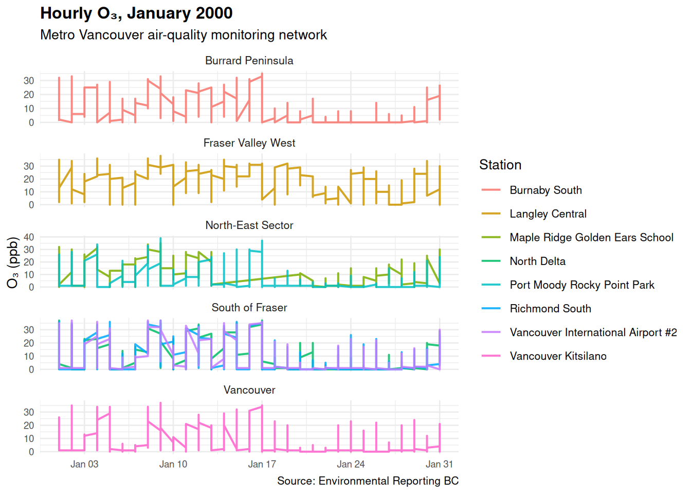
Six tools applied: geom_line, aes(colour = ...), facet_wrap, scale_x_date, labs, theme_minimal plus theme() overrides. One chart, six choices, every choice in the code.
9.15 Active learning
9.15.1 Activity 1 — Bar chart
Build a bar chart of Reforestation_ha by Fiscal_Year for the BC silviculture file. Make the bars dark green.
9.15.2 Activity 2 — Three-line chart
Reshape bc to long format with three series (Harvested, Natural_Disturbance, Reforestation). Plot all three as lines on one chart, coloured by series.
9.15.3 Activity 3 — Histogram with sensible bins
Plot a histogram of O₃ with binwidth = 1. Then try binwidth = 5. Then binwidth = 0.5. Which bin width shows the distribution shape most clearly?
9.15.4 Activity 4 — Boxplot by region
Plot O₃ by region using geom_boxplot(). Add a coord_flip() to make the regions read horizontally — easier with long region names.
9.15.5 Activity 5 — Facet a time series
Plot O₃ over time, faceted by station. Try facet_wrap(~ location) with the default scales = "fixed". Then try scales = "free_y". Which makes patterns easier to compare?
9.15.6 Activity 6 — Polish and save
Take any chart from this chapter. Add a title, subtitle, axis labels, and a caption. Save it as a 7”x5” PNG with ggsave(here("outputs", "myplot.png")). Confirm the file exists.
9.16 Practice Demo Lab
ImportantPractice demo only
This is a guided practice lab in the OER book, designed to help you learn the workflow before completing the official lab assignment on Canvas. The Canvas lab is the graded assignment. Use this activity to practice, compare your work with the reference solution, and learn how to write an AI verification prompt.
This demo lab has six parts — work them in order:
Your attempt. Work through the tasks below.
Reference solution. Compare against the worked examples earlier in this chapter (your public reference). The graded Canvas lab has its own private answer key — do not copy demo solutions into a Canvas submission.
Compare your work with the reference. Where did it match? Where did it differ? What caused the difference, and how did you fix it?
Write your own AI verification prompt. Ask an AI to check your reasoning, code, and outputs — not to produce the answer for you.
Model AI verification prompt.
“I am doing a FRST 232 practice demo lab. My dataset is
[file name](columns[columns]). I attempted[paste your steps or code]and got[paste the output]. Explain what my work does line by line, tell me whether it answers the task, and list the checks I can run to verify it against the chapter’s worked example. Do not give me the final answer.”Reflection: what changed after checking? In two or three sentences — did your attempt hold up? what did you fix? what will you check first next time?
NoteLab: Build a chart that tells a story
Work in groups of 3 or 4.
Task 1 — Pick a question. Each group picks one forestry question their chart will answer, e.g.:
- Did BC harvest area decline after 2010?
- Which region had the most extreme O₃ hours in January 2000?
- How does the relationship between harvest and reforestation change over decades?
Task 2 — Choose the right geom. Discuss: scatter, line, bar, histogram, or boxplot? Pick the one that makes the answer visible.
Task 3 — Build the plot. One member shares their screen and the group types the code together. Iterate on bin widths, scales, colours.
Task 4 — Polish. Add labs(), pick a theme, format the axes with scale_*_continuous(labels = label_comma()) or scale_x_date().
Task 5 — Save. Before saving, run this quick plot checklist:
- Is the geom right for the question (bar / line / point / box)?
- Are x and y the variables you intended?
- Do the axis labels include units?
- Are the title / subtitle informative, and is a source caption present?
- Will it save into
outputs/(not your Desktop)?
Then save the chart to outputs/ as PNG with ggsave().
Task 6 — Caption it. Write a one-sentence caption that states the headline finding in plain language. A useful template:
“This chart shows [variable] by [group / time]. The main pattern is [finding], measured in [unit].”
Task 7 — Submit. Each group submits the PNG, the code, and the caption.
TipReference solution — download
Open the Chapter 9 reference solution (rendered HTML) — the completed, rendered solution for this demo lab. Open it after your own attempt and use it to check your work.
This is the public practice solution. The graded lab on Canvas has its own private answer key — do not copy this into a Canvas submission.
9.17 Exercises
Bar chart. Recreate the polished BC reforestation bar chart from the Polish section above. Confirm it renders identically.
Three-series line chart. Pivot the BC file to long format and plot Harvested, Natural_Disturbance, and Reforestation as three coloured lines on one chart.
Histogram comparison. Plot histograms of O₃ with three different binwidths in three separate chunks. In one paragraph, justify your final binwidth choice.
Box plot. Plot O₃ by region. Add
coord_flip(). Which region has the highest median? The widest spread?Faceted plot. Plot O₃ over time, faceted by station, with one panel per station. Use
scales = "free_y".Polished composite. Take any chart from exercises 1–5 and add a title, subtitle, x label, y label, and caption. Save it as a 7×5 inch PNG in
outputs/.Smooth trend. Plot Reforestation vs Year as points, with
geom_smooth(method = "lm")overlaid. Is the trend increasing or decreasing? By how much per year (look at the slope of the fitted line)?Optional, harder. Plot mean O₃ by day-of-month for each region as lines on the same chart (
colour = region). Which region has the widest range across the month?
9.18 Optional, advanced
9.18.1 Plot themes
Built-in themes you can swap in: theme_minimal(), theme_classic(), theme_bw(), theme_void(), theme_grey() (the default). For publication-quality plots in journals, theme_classic() is usually safest.
9.18.2 Colour palettes
ggplot2’s default colour palette is fine for exploration but weak for publication. Better:
scale_colour_brewer(palette = "Set2")— categorical, printer-friendly.scale_colour_viridis_d()— categorical, colour-blind safe.scale_colour_viridis_c()— continuous, colour-blind safe.
For BC and Canadian forestry palettes, the colorspace package includes many options.
9.18.3 patchwork for multi-panel layouts
If you want two completely different plots side by side (not just facets of one plot), use the patchwork package:
library(patchwork)
p1 / p2          # stack p1 on top of p2
p1 | p2          # p1 and p2 side by side
(p1 | p2) / p3   # two-column top row, single-row bottom
9.18.4 Interactive plots
plotly::ggplotly(p) converts most ggplot objects into interactive HTML charts (hover for values, zoom, pan). Useful for web reports.
9.19 A glimpse ahead: the Integrated Case Study
The next required chapter, Integrated Case Study: Choosing the Right Tools, is where the separate skills come together. Instead of being told which function to practice, you are handed a question and a dataset and decide the workflow yourself:
- Read a realistic forestry question and choose the steps it needs.
- Combine import, inspect, clean,
filter,mutate,group_by,summarise,pivot,left_join, andggplot2in the right order. - Justify why each tool is the efficient choice — and when not to use one.
- Verify every result with row counts, missing-value checks, and a quick plot, then interpret it for a non-technical reader.
The O₃-by-station chart you just built is one piece; the case study is where you decide which pieces a real question calls for.
Spatial mapping is available as an optional extension — see the Optional: Spatial Data Analysis in R page — but it is not required for the case study.
9.20 Self-assessment quiz
1. The three core pieces of a ggplot are —
- data, file, output
- data, aesthetic mappings, geometric objects
- x, y, title
- colour, size, theme
Data + aes() + geom_*() are the minimum. Scales, themes, facets, and labels are polish.
2.
aes() in ggplot2 stands for and does what?- "aesthetic" — sets the chart's colours
- "aesthetic mapping" — maps columns in your tibble to visual properties of the chart
- "area + estimate + scale" — a statistical function
- "axis encoding system" — sets the axes
aes() connects data columns to visual properties (x, y, colour, fill, size, shape).
3. ggplot layers are added with —
- the pipe |>
- the + sign
- commas inside ggplot()
- a separate function for each layer
ggplot uses + (not |>) because it was designed before the pipe was popular. Read + as "and also draw".
4.
geom_col() requires you to supply —- Only x
- Both x and y (the y value is the bar height)
- A colour palette
- Nothing — it counts for you
geom_col uses your supplied y values as bar heights. geom_bar counts x values for you instead.5.
geom_bar() (with no y aesthetic) draws —- Lines
- Bars whose heights are the counts of each x value
- Empty bars
- A histogram
If you have raw events (one row per occurrence), use
geom_bar to count. If you have pre-computed counts, use geom_col.6.
geom_histogram(binwidth = 2) on a numeric column —- Plots two bars
- Buckets the values into 2-unit-wide bins and plots the count in each bin
- Plots the first 2 values
- Returns an error
binwidth controls the bucket size. Smaller bins = more detail; larger bins = smoother shape.
7.
geom_boxplot() shows —- The mean
- The median (line in box), interquartile range (box), and outliers (dots)
- The sum
- A linear regression
The boxplot is a robust five-number summary. The line in the box is the median, not the mean.
8.
facet_wrap(~ region) produces —- A single chart
- One panel per unique value of region (small multiples)
- An error
- A chart with region on the x-axis
Faceting creates small-multiple panels. Same chart, repeated per group.
9. For plotting three time series on one chart, the data should be in —
- Wide format (one column per series)
- Long format (one row per series × time, with a 'series' column for the colour mapping)
- Either, no difference
- A list, not a tibble
Long format lets you map
colour = series and draw all three lines in one call. Wide format requires three separate geom_line calls.10. To save a ggplot as a PNG file, use —
- save_plot()
- ggsave("outputs/myplot.png", width = 7, height = 5)
- writePNG()
- export()
ggsave infers the format from the extension. Always specify width and height explicitly.11.
labs(title = "...", x = "...") does what?- Adds new data
- Adds or replaces chart labels (title, axis labels, captions)
- Sets the colour palette
- Saves the file
labs() is the consolidated labels function — title, subtitle, x, y, colour, caption.12.
geom_smooth(method = "lm") overlays —- A loess smoother
- A linear regression line plus its confidence band
- A boxplot
- A histogram
method = "lm" fits a straight line. method = "loess" fits a flexible local-regression curve. Default for small samples is loess.13.
theme_minimal() is —- A required base layer for every chart
- One of several built-in clean themes; an alternative to the default grey-background theme
- A colour palette
- A way to hide the chart
Other built-ins: theme_classic, theme_bw, theme_void. Pick whatever matches the venue (publication, web, slides).
14.
scale_y_continuous(labels = label_comma()) does what?- Logs the y-axis
- Adds thousands separators to y-axis labels (8,264,063 instead of 8264063)
- Reverses the axis
- Adds a legend
From the scales package. Other useful formatters: label_percent, label_dollar, label_date.
15. Mapping a third variable to colour is done inside —
- labs()
- aes(colour = third_variable)
- theme(colour = ...)
- geom_*(colour = ...)
Inside aes(), colour MAPS a column to the colour aesthetic (legend appears). Outside aes(), colour = "blue" SETS the colour for all elements (no legend).
16.
geom_line() connects points —- In a random order
- In the order of the x aesthetic
- By their colour
- Counter-clockwise
geom_line draws in x-order. If your data is not sorted by x, the line zig-zags. Sort first or use geom_path for arbitrary order.
17.
position = "dodge" on a bar chart —- Stacks bars
- Places bars side by side instead of on top of each other
- Hides the bars
- Reorders the bars
Default for geom_col with a fill aesthetic is "stack".
position = "dodge" produces grouped bars (e.g., comparing harvested and reforested area side-by-side per year).18.
facet_grid(rows ~ cols) produces —- A single chart
- A two-dimensional grid of small multiples
- A pie chart
- A scatter plot
facet_wrap wraps panels into a flexible layout; facet_grid forces a rows × cols layout — useful when you have two grouping variables.
19. Pie charts in ggplot2 require
coord_polar() and are —- Strongly recommended for forestry data
- Usually replaced by a bar chart, because angles are harder to compare than lengths
- The default chart type
- Impossible to make
Pie charts are harder to read accurately. A bar chart of the same data is almost always clearer. Use pie only if the venue requires it.
20. Reflection. Which Excel chart type did you use most often before this chapter? Which ggplot2 geom replaces it? What changes about how you make charts?
Common reflections: I used Excel bar charts most — geom_col replaces them, and now every label, colour, and axis is written down in code I can re-run · Excel scatter plots were a few clicks but I never knew which buttons set what — ggplot makes the choices explicit · I never used boxplots in Excel because they were hard; in ggplot they are one line · The biggest change is faceting — small multiples are trivial in ggplot but a manual nightmare in Excel.
9.21 AI as a debugging companion
TipUseful prompts
“My ggplot only draws one line, but my long-format tibble has three series. What did I miss in aes()?” (Almost always: forgot to add
group = seriesorcolour = series.)“How do I make the x-axis show dates like ‘Jan 15’ instead of ‘2000-01-15’ in ggplot?” (Answer:
scale_x_date(date_labels = "%b %d").)“My chart’s y-axis says 8.26e+06 instead of 8,264,063. How do I fix it?” (Answer:
scale_y_continuous(labels = label_comma()).)
9.22 Reading
- R for Data Science — chapters 1 Data visualisation and 12 Communication. Free at https://r4ds.hadley.nz/.
- ggplot2: Elegant Graphics for Data Analysis (Wickham, Navarro, Pedersen) — the canonical reference. Free at https://ggplot2-book.org/.
- The ggplot2 cheatsheet (PDF): https://rstudio.github.io/cheatsheets/data-visualization.pdf