| Property | BC silviculture | Ontario forest stats |
|---|---|---|
| File | bc_disturbance_reforestation.xlsx |
on_forest_statistics_1.xlsx |
| Source | BC Government / BC Data Catalogue | Government of Ontario / Ontario Open Data Catalogue |
| Used for | Time-series charts (line, area) | PivotTables, cross-classification charts |
| Shape | Time series (one row per fiscal year) | Cross-classification (region × ownership × seral × type × age) |
| Rows × Cols | 37 × 8 | 179 × 8 |
3 Excel Visualization and PivotTables
NoteData for this chapter
This chapter uses the BC silviculture (bc_disturbance_reforestation.xlsx) and Ontario forest statistics (on_forest_statistics_1.xlsx) workbooks. Click each file name to download it directly, then save it in your data/ folder. For sources and details, see the Datasets Used in This Book page.
Chapter goals
By the end of this chapter you will be able to:
- Choose the right chart type for the question being asked (bar, column, line, scatter).
- Build clean Excel charts with titles, axis labels, and captions that another reader could understand on their own.
- Construct a PivotTable from a tidy dataset, choosing what goes in Rows, Columns, Values, and Filters.
- Switch the aggregation function (sum, count, average) inside a PivotTable and predict what each one returns.
- Connect a PivotChart to a PivotTable and keep them in sync.
- Add Slicers to a PivotTable to give a non-technical reader controls to explore the data.
- Refresh PivotTables when the underlying data changes, and recognize the silent-bug risk if you forget.
- Recreate a PivotTable manually with
SUMIFSandCOUNTIFS— the bridge to how the same logic works in R. - Export a finished chart to a PNG with a caption ready for a report or a course-site submission.
Expected output for this chapter
TipWhat you will hand in
- One PivotTable + PivotChart built on
on_forest_statistics_1.xlsx, answering one forestry question of your choice (e.g., “Total mature area by forest type” or “Count of combinations by seral stage and age class”). Exported as a PNG with caption. - One time-series chart built on
bc_disturbance_reforestation.xlsx, showing reforestation, harvest, and natural disturbance from 1987 to 2023 on the same axes. Exported as a PNG with caption. - One short worksheet matching common forestry questions to the correct chart type (provided in the learner workbook).
- A short group-lab worksheet (or screenshot) submitted to the course site.
This list is the same as the rubric for the chapter assignment. Keep it in view while you work.
3.1 Why visualization matters
A number in a cell is a fact. A chart is an argument. The same data, in the same workbook, can become a story about reforestation finally catching up to harvest (a single time-series chart) or a story about a record-breaking wildfire season (a bar chart with 2017 visibly above the rest). Choosing how to display data is part of the analysis, not an after-the-fact decoration.
The transition matrix for this course explicitly treats Chapter 3 as the bridge from raw Excel work into tidy-data thinking. The PivotTable you build in this chapter is conceptually the same as a group_by() |> summarise() pipeline in R — which you will write in Chapter 7. The chart you build is the conceptual ancestor of ggplot2, which you will meet in Chapter 9.
For now, the goal is to be fluent in the Excel versions, so that when we move to R, you already know what each command is doing.
3.2 The two datasets for this chapter
This chapter uses two openly licensed files you have already met:
ImportantFile-handling rules carry over
Same two rules as Chapters 1 and 2:
- Keep the raw downloaded files unchanged in your
data/folder. - Save any cleaned or chart-ready version under
_clean.xlsxin youroutputs/folder.
You will work mostly on the clean copies for this chapter.
3.3 Choosing the right chart type
Before opening the chart dialog, answer one question: what is the chart for?
| If your question is… | The natural chart is… |
|---|---|
| How has this number changed over time? | Line chart (or area chart) |
| How do these categories compare? | Bar chart (horizontal) or column chart (vertical) |
| How does Y relate to X across observations? | Scatter plot |
| What share does each part take of a whole? | Stacked bar (or pie, sparingly) |
| Where are the extremes / outliers? | Bar chart sorted by value |
| How does one group differ from another over time? | Multi-series line chart |
WarningWhen not to use a pie chart
Pie charts are easy to draw and hard to read. The human eye is bad at comparing angles. Use a sorted bar chart instead, except for:
- 2–3 categories where you specifically want to communicate share of whole,
- A clear majority slice (e.g., “97 % vs 3 %”).
In every other case, a sorted bar chart is the better tool.
3.3.1 Worked example — choosing a chart for BC silviculture
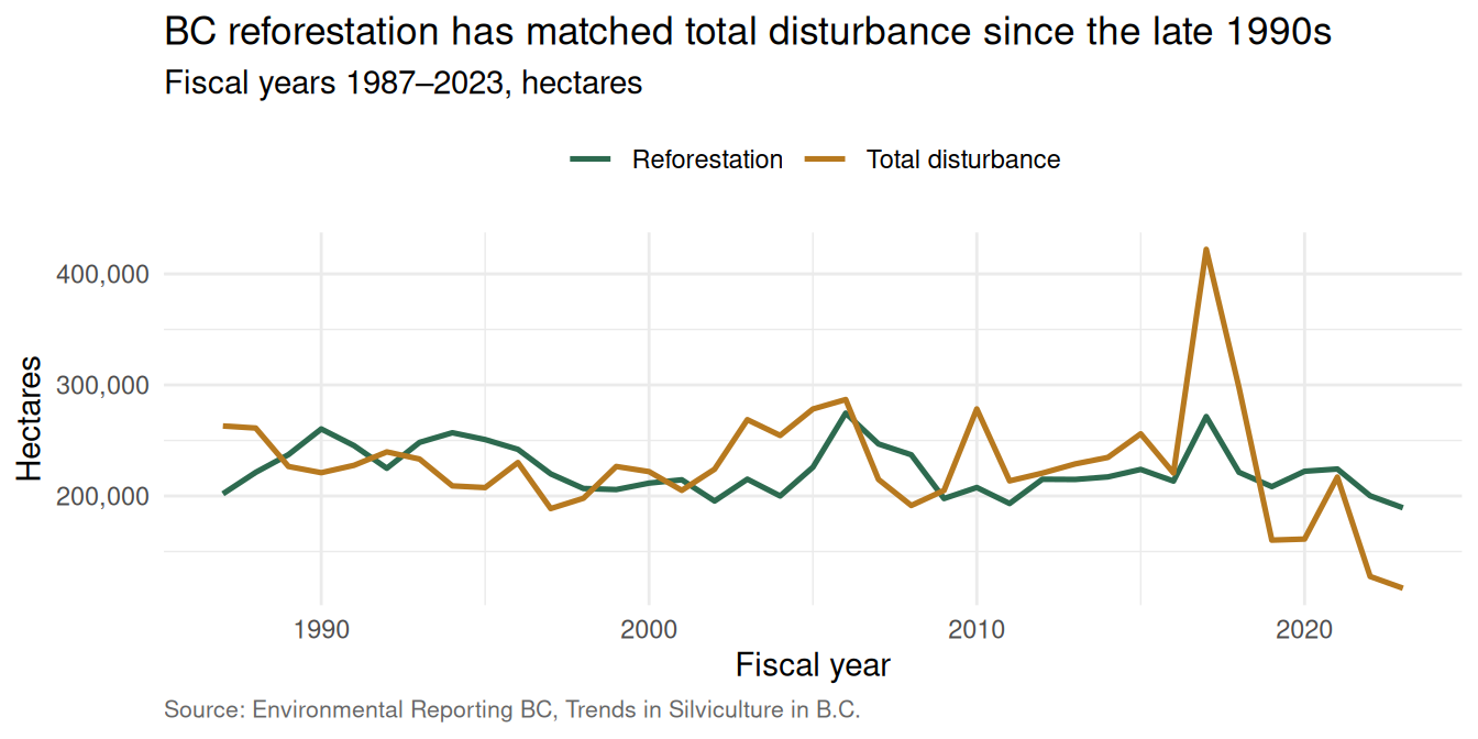
Suppose you want to answer: “How has BC reforestation kept pace with disturbance since 1987?”
The question is about change over time. So: line chart, with two series:
Total_Disturbance_haoverFiscal_YearReforestation_haoverFiscal_Year
In Excel:
- Select the three columns
Fiscal_Year,Total_Disturbance_ha, andReforestation_ha. If they are not next to each other, click the first column, then hold Ctrl (Cmd on Mac) and click the others to select non-adjacent columns. - Insert → Charts → Line chart.
- Add chart elements: title, axis titles, data labels (sparingly), caption / source line.
The 2017 spike — BC’s record wildfire season — is the most visible feature. The chart itself is the argument.
3.4 Chart anatomy
A finished chart has six elements. Every one is editable; many are hidden by default.
| Element | Why it matters | How to edit |
|---|---|---|
| Title | Tells the reader what the chart is for. Should be a one-line sentence. | Click chart → Chart Elements (+) → Chart Title |
| Axis titles | Tell the reader what each axis is measuring (and in what units). | Chart Elements → Axis Titles |
| Legend | Identifies each series. Skip if there is only one series. | Chart Elements → Legend |
| Data labels | Numbers on the data points. Use sparingly. | Chart Elements → Data Labels |
| Source / caption | One line at the bottom naming the data source and date. | Insert → Text Box, anchor below chart |
| Theme | Colour and font choices. Should match the rest of the deliverable. | Chart Design ribbon → Chart Styles |
3.4.1 Title rules
A bad title is “Chart 1” or “Reforestation_ha vs Fiscal_Year”.
A good title is “BC reforestation has matched total disturbance since the late 1990s” — a one-sentence claim the chart supports.
If you cannot write a one-sentence claim for the chart, the chart is the wrong chart for your question.
3.4.2 Axis labels and units
Always include units in axis labels: “Hectares”, not just “Area”. “Fiscal year”, not just “Year”.
For very large numbers, use a thousands separator and consider abbreviating the axis (200K instead of 200,000). Excel does this through Format Axis → Display units → Thousands.
3.5 PivotTables
NoteAI prompt to check your work
Use this after your own attempt. It should check your reasoning, not hand you the answer:
“I built a PivotTable with
[fields]in Rows/Columns and[field]summarised by[Sum/Average/Count]. Check whether that layout answers my question, whether Sum vs Average vs Count is the right summary, and what to verify (grand totals, blank cells, a manual spot-check, refreshing after data changes). Do not build a different pivot for me.”
A PivotTable is Excel’s most underused feature for forestry data. It takes a tidy table — one row per observation, one column per variable — and rearranges it into a summary.
The Ontario file is tidy and cross-classified, which makes it perfect for a PivotTable.
3.5.1 What a PivotTable does
Given the 179-row Ontario file, a PivotTable can produce any of:
- A table of total area by forest type (one number per row).
- A table of total area by forest type × seral stage (rows × columns).
- A table of average area by forest type × seral stage.
- A count of how many age-class combinations exist for each forest type.
All without writing a single formula.
| PFTName | Immature | Late Successional | Mature | Pre-Sapling | Sapling |
|---|---|---|---|---|---|
| Conifer Lowland | 426,314 | 1,193,510 | 903,009 | 240,759 | 229,741 |
| Conifer Upland | 655,387 | 474,772 | 745,944 | 289,253 | 700,537 |
| Jack Pine | 132,570 | 6,833 | 92,894 | 39,072 | 156,346 |
| Mixedwood | 493,741 | 153,687 | 471,449 | 79,606 | 145,449 |
| Poplar | 189,289 | 169,293 | 219,451 | 64,766 | 195,822 |
| Red and White Pine | 2,222 | 2,436 | 4,026 | 2,786 | 2,180 |
| Tolerant Hardwoods | 475 | 113 | 1,142 | 82 | 20 |
| White Birch | 105,663 | 93,154 | 242,519 | 31,927 | 37,802 |
3.5.2 Building one — step by step
- Click any cell inside the Ontario
Datasheet. - Insert → PivotTable. A dialog opens. (Mac: if you do not see it directly, use Insert → Tables → PivotTable.)
- Choose New Worksheet as the destination. Click OK.
- A blank PivotTable appears on a new sheet, with a PivotTable Fields panel on the right.
- Drag fields into the four zones:
- Rows:
PFTName - Columns:
SERAL_NAME - Values:
SumOfTotalHa - Filters: (leave empty for now)
- Rows:
- Excel automatically picks
Sumas the aggregation. Confirm. - Format the numbers: right-click any value → Number Format → Number → 1000 separator → 0 decimals.
You should now see the cross-tab shown above.
3.5.3 Changing the aggregation
Right-click any value in the PivotTable → Value Field Settings. A list of aggregations appears. Mac: if right-click does not show it, click the small information icon (i) next to the field name in the PivotTable Fields panel to open the same settings.
| Aggregation | What it returns | When to use |
|---|---|---|
| Sum | Total of the values | Default for most quantities. |
| Count | How many rows match | “How many combinations are there?” |
| Average | Mean of the values | “What is the typical row in this group?” |
| Max | Largest value | “Which group has the biggest single cell?” |
| StdDev | Variability around the mean | “How spread out are the values?” |
The same PivotTable can answer multiple questions by switching the aggregation. Try it.
3.5.4 Drag-and-drop pivot
The most useful PivotTable habit is moving fields around:
- Drag
PFTNamefrom Rows to Columns. The whole table flips. - Drag
AC_10into Rows belowPFTName. You get nested groups. - Drag
SERAL_NAMEinto Filters. A dropdown appears above the table — choose one seral stage to filter the whole pivot.
This is the fluency PivotTables train. Drag, observe, drag back.
3.5.5 Refreshing
A PivotTable is a snapshot of the data at the moment you built it. If the underlying Data sheet changes, the PivotTable does not automatically update.
To refresh: click anywhere in the PivotTable, then PivotTable Analyze → Refresh (or right-click → Refresh).
WarningA silent-bug warning
If you change the Data sheet and forget to refresh the PivotTable, the chart you export will be based on stale data. There is no warning. Always refresh before exporting.
3.6 PivotCharts
A PivotChart is a chart wired to a PivotTable. When you change the PivotTable, the chart changes with it.
To create one:
- Click anywhere inside an existing PivotTable.
- PivotTable Analyze → PivotChart.
- Choose a chart type. For a cross-classification, a clustered column or stacked column chart usually works best.
The chart appears with field buttons on it. Those buttons are interactive — clicking them filters the chart (and the PivotTable behind it).
3.6.1 Slicers
A Slicer is a visual filter panel. Click any PivotTable → PivotTable Analyze → Insert Slicer. Check PFTName. Click OK.
A panel of buttons appears, one per forest type. Click “Jack Pine” — the PivotTable (and the PivotChart) filter to Jack Pine only. Ctrl+Click (Cmd+Click on Mac) to add more forest types, or Shift+Click to select a range.
Slicers are excellent for presentations because they let a non-technical reader explore the data without learning Excel.
3.7 Recreating a PivotTable with formulas
PivotTables are fast and visual, but they are not the only way to build a cross-tab. You can recreate one with SUMIFS and COUNTIFS — the formula approach.
This matters because the formula version is the closest thing to what you will write in R.
3.7.1 Example: SUMIFS cross-tab on the Ontario file
Build a small table on a new sheet:
| Pre-Sapling | Sapling | Immature | Mature | Late Successional | |
|---|---|---|---|---|---|
| Jack Pine | =SUMIFS(...) |
=SUMIFS(...) |
… | … | … |
| Conifer Upland | … | … | … | … | … |
| Conifer Lowland | … | … | … | … | … |
| Mixedwood | … | … | … | … | … |
| Poplar | … | … | … | … | … |
| White Birch | … | … | … | … | … |
| Red and White Pine | … | … | … | … | … |
| Tolerant Hardwoods | … | … | … | … | … |
Each cell is a SUMIFS formula like:
=SUMIFS(Data!$H:$H, Data!$F:$F, $A2, Data!$D:$D, B$1)Data!$H:$HisSumOfTotalHa.Data!$F:$FisPFTName.Data!$D:$DisSERAL_NAME.$A2is the row label (a forest type).B$1is the column label (a seral stage).
Notice the mixed references: $A2 (column locked, row moves) and B$1 (row locked, column moves). This is the cell-reference pattern you learned in Chapter 2 — it lets one formula copied across the whole grid produce the right answer in every cell.
The result is the same numbers as the PivotTable, but the formulas are explicit, auditable, and version-controllable.
TipWhen to use which
- For exploration — drag-and-drop PivotTable. Fast.
- For production reports that need to be reproducible — formula cross-tab with
SUMIFS. Auditable. - For scripted analysis — neither, use R (Chapter 7).
3.8 Exporting a chart with a caption
A chart in Excel is not a deliverable. A chart outside Excel — saved as a PNG with a caption — is a deliverable.
3.8.1 To save as PNG
Right-click the chart border → Save as Picture. Choose PNG. Save into your outputs/ folder.
3.8.2 Caption format
A caption is one short sentence that:
- Tells the reader what the chart shows.
- Names the data source.
- Notes the date or version.
Example:
Figure 1. BC reforestation has tracked total disturbance since 1999, with the exception of the 2017 wildfire spike. Source: Environmental Reporting BC, Trends in Silviculture in B.C., retrieved 2026-05-24.
Put the caption in the report document, not in the PNG itself.
3.9 Connecting charts to the data dictionary
Every chart should be traceable back to the ReadMe sheet of the file it came from. Three habits make this easy:
- Name the chart after the variable it shows. “Total reforestation by year” is better than “Chart 3”.
- Save the PNG with a snake_case name that includes the variable.
reforestation_by_year.pngis better thanchart3.png. - In the caption, reference the variable by its exact ReadMe name. “
Reforestation_ha” is better than “reforestation”.
This sounds fussy but pays off the first time someone asks “which column is this from?”.
3.10 Active learning
3.10.1 Activity 1 — Choose the right chart
A list of forestry questions appears in the learner workbook. Match each one to its best chart type from this menu: line, bar, column, scatter, stacked column, pie. Defend your choices in pairs.
3.10.2 Activity 2 — Build the BC time-series chart
Open bc_disturbance_reforestation_clean.xlsx (your working copy). Select Fiscal_Year, Total_Disturbance_ha, and Reforestation_ha. Insert → Charts → Line. Add a title, axis labels, and a caption. Save as outputs/bc_disturbance_reforestation_chart.png.
3.10.3 Activity 3 — Build a PivotTable
Open on_forest_statistics_1_clean.xlsx. Insert a PivotTable with PFTName in Rows, SERAL_NAME in Columns, SumOfTotalHa in Values. Verify the totals match the table in the chapter prose above.
| PFTName | total_ha |
|---|---|
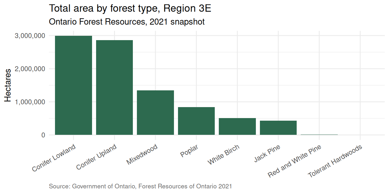
| Conifer Lowland | 2,993,333 |
| Conifer Upland | 2,865,892 |
| Mixedwood | 1,343,933 |
| Poplar | 838,621 |
| White Birch | 511,064 |
| Jack Pine | 427,715 |
| Red and White Pine | 13,649 |
| Tolerant Hardwoods | 1,832 |
3.10.4 Activity 4 — Switch the aggregation
Right-click any value in your PivotTable → Value Field Settings → Count. The cell values change from total hectares to number of age-class combinations for that group. How does the picture change?
| PFTName | n |
|---|---|
| Conifer Upland | 26 |
| Poplar | 25 |
| White Birch | 25 |
| Conifer Lowland | 23 |
| Mixedwood | 23 |
| Jack Pine | 22 |
| Red and White Pine | 22 |
| Tolerant Hardwoods | 13 |
3.10.5 Activity 5 — Add a slicer
To your PivotTable, add a Slicer on LGDS (the seral-stage code). Click each button in turn. Which forest types disappear at the “Pre-Sapling” stage? Which dominate at “Mature”?
3.11 Practice Demo Lab
ImportantPractice demo only
This is a guided practice lab in the OER book, designed to help you learn the workflow before completing the official lab assignment on Canvas. The Canvas lab is the graded assignment. Use this activity to practice, compare your work with the reference solution, and learn how to write an AI verification prompt.
This demo lab has six parts — work them in order:
Your attempt. Work through the tasks below.
Reference solution. Compare against the worked examples earlier in this chapter (your public reference). The graded Canvas lab has its own private answer key — do not copy demo solutions into a Canvas submission.
Compare your work with the reference. Where did it match? Where did it differ? What caused the difference, and how did you fix it?
Write your own AI verification prompt. Ask an AI to check your reasoning, code, and outputs — not to produce the answer for you.
Model AI verification prompt.
“I am doing a FRST 232 practice demo lab. My dataset is
[file name](columns[columns]). I attempted[paste your steps or code]and got[paste the output]. Explain what my work does line by line, tell me whether it answers the task, and list the checks I can run to verify it against the chapter’s worked example. Do not give me the final answer.”Reflection: what changed after checking? In two or three sentences — did your attempt hold up? what did you fix? what will you check first next time?
NoteLab: Build a chart-and-PivotTable deliverable together
Work in groups of 3 or 4. One submission per group.
Task 1 — Choose the question. As a group, choose one forestry question your PivotTable will answer. Options:
- “Which forest type has the most mature area in Region 3E?”
- “Which age class has the most total area, across all types?”
- “How does conifer-vs-hardwood area compare across seral stages?”
Task 2 — Build the PivotTable. Open on_forest_statistics_1_clean.xlsx. Insert a PivotTable that answers your question. Decide together what goes in Rows, Columns, and Values.
Task 3 — Build the PivotChart. From your PivotTable, insert a PivotChart of an appropriate type. Add a title, axis labels, and ensure units (hectares) appear in the y-axis label.
Task 4 — Add a slicer. Insert at least one slicer (any categorical field). Confirm that clicking a slicer button changes both the PivotTable and the PivotChart.
Task 5 — Export and caption. Save the PivotChart as a PNG into outputs/. Write a one-sentence caption that includes the data source.
Task 6 — Submit. Submit a short worksheet showing your question, your field choices, and the exported PNG + caption. Include all group members’ names.
This lab is designed to fit comfortably inside a single hands-on session.
TipReference solution — download
Open the Chapter 3 reference solution (HTML answer key) — the completed, task-by-task answer key — or download the completed Excel workbook with the formulas worked into the sheets (it recalculates when you open it in Excel). Open it after your own attempt and use it to check your work.
This is the public practice solution. The graded lab on Canvas has its own private answer key — do not copy this into a Canvas submission.
3.12 Exercises
These are the take-home exercises that go with this chapter.
Open
bc_disturbance_reforestation.xlsx. Build a column chart ofNatural_Disturbance_habyFiscal_Year. Add a title that names the 2017 wildfire spike. Export as PNG.Open
on_forest_statistics_1.xlsx. Build a PivotTable withSERAL_NAMEin Rows andSumOfTotalHain Values (usingSum). Sort the table by descending total area. Which seral stage covers the most area?On the same PivotTable, change the aggregation from
SumtoCount. Which seral stage has the most age-class combinations? Is it the same answer as Exercise 2?Build a manual SUMIFS cross-tab with
PFTNamedown the left andSERAL_NAMEacross the top. Verify your numbers match the PivotTable.Add a slicer on
PFTto your PivotTable. Take a screenshot showing the table when one forest-type slicer is active.Write a one-page chart-caption sheet listing the captions you would use for the three exported PNG files (Exercises 1, 2, and the group lab output). Save as
outputs/chart_captions.docxorchart_captions.md.Optional, harder. Build a dashboard sheet containing your time-series chart from Exercise 1 and your PivotChart from Exercise 2 side by side, with a slicer that controls both. (Hint: a slicer can connect to multiple PivotTables built from the same data source.)
3.13 Optional, advanced
3.13.1 Sparklines
A sparkline is a tiny chart inside a single cell. Useful for trend-at-a-glance summaries inside a table.
To insert: Insert → Sparklines → Line (or Column, or Win/Loss). Select the data range, then choose the cell where the sparkline goes.
3.13.2 Conditional-formatted data bars
Inside a PivotTable, you can add Data Bars to a value column. Select the values → Home → Conditional Formatting → Data Bars. The cells now show a tiny in-cell horizontal bar proportional to the value — a quick way to add visual rank to a table.
3.13.3 Calculated fields
A Calculated Field is a column in a PivotTable derived from other PivotTable fields. To add one: PivotTable Analyze → Fields, Items, & Sets → Calculated Field.
Example: in the Ontario file you could add a area_per_age_class calculated field equal to SumOfTotalHa / AC_10. Use sparingly — calculated fields are powerful but easy to hide a typo inside.
3.14 A glimpse ahead: From Excel to ggplot2
In Chapter 9 you will rebuild the BC and Ontario charts from this chapter using ggplot2 in R. The Excel moves you learned here map to R commands you will meet later:
| What you did in Excel (Ch 3) | What you will do in R (Ch 9) |
|---|---|
| Insert → Line chart | ggplot(bc, aes(Fiscal_Year, Reforestation_ha)) + geom_line() |
| Insert → Column chart | ggplot(...) + geom_col() |
| Chart title in the chart area | labs(title = "...") |
| Axis title “Hectares” | labs(y = "Hectares") |
| Add caption in a text box | labs(caption = "Source: ...") |
PivotTable with PFTName in Rows |
ontario \|> group_by(PFTName) \|> summarise(sum(SumOfTotalHa)) |
PivotTable with PFTName × SERAL_NAME |
... \|> group_by(PFTName, SERAL_NAME) \|> summarise(...) \|> pivot_wider(...) |
Slicer on PFTName |
... \|> filter(PFTName == "Jack Pine") |
| Refresh PivotTable (manual) | Automatic — re-running the code re-computes everything |
| PNG export via Save as Picture | ggsave("outputs/bc_reforestation.png", width = 7, height = 4) |
The intent is identical. R is scriptable; Excel is visual. Chapter 9 will walk through each row of this table in detail. The point right now is that the chart vocabulary you learn here transfers directly.
3.15 Self-assessment quiz
Click the answer you think is correct. The right answer turns green; wrong answers turn red and the correct one is revealed. Explanations appear below each question.
1. You want to show how BC reforestation has changed from 1987 to 2023. Which chart type is best?
- Pie chart
- Line chart
- Scatter plot
- Stacked bar
Time series with a single quantity over time → line chart. Pie shows share of a whole; scatter shows X vs Y relationships; stacked bar shows composition.
2. A PivotTable is built from a tidy table. What four field zones does it use?
- Headers, Values, Footer, Title
- Rows, Columns, Values, Filters
- Sum, Count, Average, Max
- X-axis, Y-axis, Legend, Caption
Rows go down the left, Columns go across the top, Values are the numeric quantities being aggregated, Filters apply to the whole pivot.
3. You change the underlying Data sheet after building a PivotTable. What must you do for the PivotTable to show the new numbers?
- Nothing — the PivotTable updates automatically
- Right-click the PivotTable → Refresh (or PivotTable Analyze → Refresh)
- Rebuild the PivotTable from scratch
- Delete the Data sheet
PivotTables are snapshots, not live views. Forgetting to refresh after a data change is the most common silent bug in PivotTable-based reporting.
4. A PivotChart is —
- A type of chart that does not need data
- A chart wired to a PivotTable, which updates when the PivotTable changes
- A chart that automatically becomes a pie chart
- A chart with a slicer attached
PivotChart and its PivotTable are linked — change one and the other follows. This is why pivot-based charts are easier to keep current than hand-built charts.
5. Which chart title is better?
- "Chart 1"
- "Reforestation_ha vs Fiscal_Year"
- "BC reforestation has tracked total disturbance since the late 1990s"
- "My chart"
A good title is a one-sentence claim the chart supports. If you cannot write such a claim, the chart is probably the wrong chart for your question.
6. In a PivotTable summarizing the Ontario file, you put
PFTName in Rows, SERAL_NAME in Columns, and SumOfTotalHa in Values with aggregation Sum. One cell shows 178,000. That number is —- The total area of all forest types
- The number of rows with that forest type and seral stage
- The total hectares for one (forest type, seral stage) combination
- The average area for that forest type
Each interior cell of the PivotTable is the sum of
SumOfTotalHa for the rows that match both the row label and the column label.7. A Slicer is best understood as —
- A new chart type
- A clickable visual filter panel that controls one or more PivotTables / PivotCharts
- A way to delete rows
- A function in the formula bar
Slicers are visual filters. They are excellent for presentations because non-technical readers can explore the data by clicking buttons.
8. Which Excel formula recreates a PivotTable cell that sums
SumOfTotalHa for "Jack Pine" × "Mature" combinations?- =SUM(SumOfTotalHa)
- =SUMIF(PFTName, "Jack Pine", SumOfTotalHa)
- =SUMIFS(SumOfTotalHa, PFTName, "Jack Pine", SERAL_NAME, "Mature")
- =COUNTIFS(PFTName, "Jack Pine", SERAL_NAME, "Mature")
SUMIFS sums one range subject to multiple criteria — exactly what a PivotTable cell does. COUNTIFS would return a row count, not a sum.9. Why is a pie chart usually a bad choice for comparing forest type areas across 8 forest types?
- Excel cannot draw pie charts
- Humans are bad at comparing angles; a sorted bar chart is easier to read
- Pie charts are not allowed in forestry
- Pie charts always use the wrong colors
The eye compares lengths much better than angles. For 8 categories, a sorted bar chart lets the reader rank values at a glance.
10. Where does the Ontario forest statistics file come from?
- A textbook
- The Government of Ontario, distributed through the Ontario Open Data Catalogue
- A research blog
- A private consulting firm
Both datasets in this chapter are open government data. The Ontario file is from the Ministry of Natural Resources and Forestry, published under the Open Government Licence — Ontario.
11. You build a column chart of
Natural_Disturbance_ha by Fiscal_Year. One year's column is much taller than every other. Which year?- 1987
- 2010
- 2017
- 2023
2017 was BC's record wildfire season — 218,275 ha. Always look at the chart extremes; the outlier tells you something about the world.
12. When exporting a PivotChart for a report, which file format is best?
- XLSX
- PNG (right-click chart → Save as Picture)
- CSV
- TXT
PNG (or SVG) is a stand-alone image that any reader can open without Excel. CSV and TXT are data formats, not image formats.
13. A chart caption should always include —
- The Excel version you used
- A one-sentence description and the data source
- Your full name
- A list of every formula in the workbook
A good caption tells the reader what the chart shows and where the data came from. Date or version is also useful.
14. What does the mixed reference
$A2 mean in a formula copied across a grid?- Both the row and column are locked
- The column is locked; the row moves as the formula is copied
- The row is locked; the column moves
- Nothing is locked
The
$ before A locks the column. When you copy the formula down, $A2 becomes $A3, $A4, etc. When you copy it right, it stays $A2.15. In a PivotTable, switching the Value aggregation from
Sum to Count changes —- The colors of the cells
- The row and column labels
- The interior values, from "total hectares" to "number of rows in that group"
- The Data sheet
The aggregation function controls what the interior cells display.
Sum adds the values; Count counts how many rows fall in the group.16. You add a Slicer for
PFTName to your PivotTable. You click "Jack Pine". What happens to the PivotChart wired to the same PivotTable?- Nothing — slicers do not affect charts
- The chart filters to show only Jack Pine data, in sync with the PivotTable
- The chart shows an error
- The slicer creates a new chart
Slicers, PivotTables, and PivotCharts are linked. A slicer filters the PivotTable, and the chart follows automatically.
17. What is the closest R equivalent of an Excel PivotTable cell built with
Sum?- read_excel(...)
- group_by(...) |> summarise(sum(...))
- ggplot(...) + geom_line()
- filter(...)
A PivotTable aggregating by a category is conceptually
group_by() followed by summarise(). This is the bridge to Chapter 7.18. The PNG file you submit for the chapter assignment should live in which folder of your project?
- data/
- outputs/ (or deliverables/, if the file is the final submission)
- shared/
- It does not matter
data/ is for raw input files only. Generated files like PNG charts go in outputs/, and the version you actually submit goes in deliverables/.19. A reader asks "which column did your chart come from?" You should answer by —
- Guessing from the chart title
- Pointing to the ReadMe sheet entry for the exact variable named in the caption
- Recreating the chart from memory
- Saying it does not matter
This is why captions reference variables by their exact ReadMe names. Traceability from chart → caption → ReadMe → Data column is what makes the work auditable.
20. Reflection. Describe one chart or PivotTable you built for this chapter that surprised you — anything you noticed in the data that you did not expect.
Common observations: the 2017 wildfire spike is hard to even see on a linear axis — it is so much bigger than anything else that other years look flat · mature Conifer Lowland dominates the Ontario file in terms of area · most forest types have very few rows in the Pre-Sapling stage, which makes sense for old commercial landbases · switching from Sum to Count completely changes which forest type "leads" — total area and number of combinations tell different stories.
3.16 AI as a debugging companion
TipUseful prompts for this chapter
“In Excel, my PivotTable shows only zeros for one row. The underlying Data sheet has values. What are the three most common reasons a PivotTable shows zeros?”
“Explain step by step how to add a slicer to an existing PivotTable and link it to a second PivotTable on the same sheet.”
“I want to recreate this PivotTable cell with a formula — sum of
SumOfTotalHaforPFTName = 'Jack Pine'andSERAL_NAME = 'Mature'. What is the SUMIFS formula?”
3.16.1 Verifying AI’s answers
After AI suggests a chart type or PivotTable layout, check:
- Does the chart actually answer the question you asked?
- Does the title state a one-sentence claim?
- Do the units appear in the axis label?
- Did the AI refresh the PivotTable in its instructions? (It often forgets.)
AI’s chart suggestions are starting points. The interpretation is yours.
3.16.2 When not to use AI
- Do not let AI choose the chart type without you stating the question. The chart serves the question; the question serves you.
- Do not let AI invent a caption that names a source you have not verified.
3.17 Reading
- Microsoft Excel official documentation on PivotTables.
- Microsoft Excel official documentation on PivotCharts.
- Cole Nussbaumer Knaflic, Storytelling with Data (chapter on chart choice — short, opinionated, practical).
- BC Government silviculture indicator background: https://www.env.gov.bc.ca/soe/indicators/land/silviculture.html
- Ontario open-data dataset page: https://data.ontario.ca/dataset/forest-resources-of-ontario-2021